
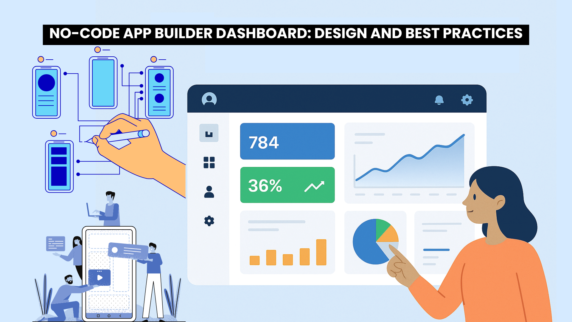
A no-code app builder dashboard is the control center of your entire app ecosystem. It’s where users monitor performance, manage data, and control app functionality—all without writing a single line of code.
In a world where businesses and creators are shifting toward no-code platforms like Bubble, Glide, or Adalo, a well-designed dashboard is not just a convenience—it’s a necessity. A thoughtfully built dashboard can transform user experience, simplify analytics, and help users make better, faster decisions.
In this comprehensive guide, we’ll explore how to design, structure, and optimize a no-code app builder dashboard for maximum usability, scalability, and performance.
What is a No-Code App Builder Dashboard?
A dashboard in a no-code platform is a centralized interface where all data, analytics, and control elements come together. It allows users—often non-developers—to visualize metrics, manage workflows, and control their app operations visually.
For example:
-
In an eCommerce app builder, the dashboard might show total sales, customer insights, and product trends.
-
In a project management tool, it could display tasks, timelines, and team activity.
A dashboard is not just a display—it’s the heartbeat of the app builder, helping users analyze, act, and adapt without technical complexity.
Why the Dashboard Design Matters
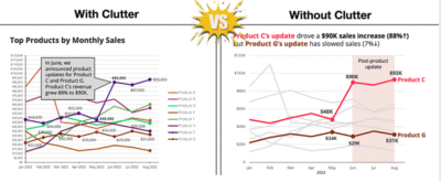
Cluttered VS. Clean Dashboard Layout
Your dashboard design directly impacts usability, adoption, and satisfaction. A cluttered or confusing dashboard makes users abandon your app, while a clean, structured one builds trust and engagement.
A great dashboard should:
-
Present key information at a glance (KPIs, trends, actions).
-
Reduce the number of clicks to reach essential features.
-
Deliver an intuitive navigation experience.
-
Align with your app’s visual identity.
Core Components of a No-Code App Builder Dashboard
A no-code app builder dashboard is more than just a visual display — it’s the heart of your app-building experience. It connects data, design, and user interaction into one unified control panel.
1. Header Bar
-
Acts as the top control strip of your dashboard.
-
Includes app name, user profile, notifications, and quick settings.
-
Keeps all essential actions within quick reach.
-
Should remain clean and minimal to avoid clutter.
Tip: Use a sticky header that stays visible while scrolling for better usability.
2. Sidebar Navigation
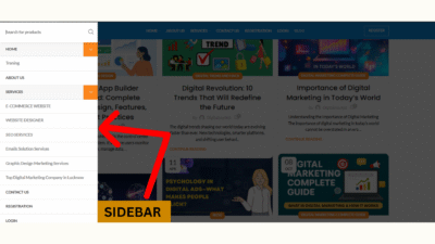
Sidebar
-
Functions as the main map of your app.
-
Lists all key modules like Analytics, Settings, Data, and Users.
-
Use both icons and labels for better clarity.
-
Keep navigation simple and consistent throughout the app.
3. Main Content Area
-
The central workspace of your dashboard.
-
Displays dynamic widgets, charts, KPIs, and tables.
-
Use a grid layout so widgets adjust naturally across devices.
-
Prioritize key insights at the top, secondary data below.
4. Filters & Time Selectors
-
Let users customize data views (daily, weekly, monthly, etc.).
-
Offer pre-set options like “Today,” “This Week,” or “Last 30 Days.”
-
Improves user control and data precision.
5. Cards & Widgets
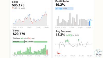
Dashboard with KPI cards
-
Each widget represents a data insight (user growth, revenue, performance).
-
Combine visual charts + numeric KPIs for instant understanding.
-
Avoid overcrowding — show only what truly matters.
6. Alerts & Notifications
-
Display live system alerts, messages, or updates.
-
Keep users informed about key events (like new signups or errors).
-
Use color codes: Green = Success, Red = Warning, Blue = Info.
7. Help & Support Section
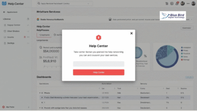
Help Center Popup
-
Provides FAQs, tutorials, and quick access to live chat.
-
Builds trust and improves user onboarding.
-
Place it in an easily accessible corner (bottom-right works best).
UX and UI Principles for Dashboard Design
A great no-code app builder dashboard depends on excellent UX (User Experience) and UI (User Interface) design. It determines how users feel, navigate, and act inside your app.
1. Clarity and Simplicity
-
Show only the data that truly matters.
-
Avoid too many charts or text blocks.
-
Clean design = faster understanding.
2. Visual Hierarchy
-
Place key KPIs and metrics above the fold.
-
Use color, size, and position to draw user attention.
-
Highlight most-used actions (e.g., “Add New” or “Save”).
3. Color Psychology
-
Use color meaningfully:
-
🟢 Green → Growth or success
-
🔴 Red → Alerts or errors
-
🔵 Blue → Stability and analytics
-
-
Stick to a 3–4 color palette for balance.
4. Typography
-
Use clean fonts like Inter, Poppins, or Roboto.
-
Maintain consistent text hierarchy: Headings > Subheadings > Body.
-
Ensure all text is readable on mobile.
5. Responsiveness
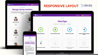
Responsiveness Layouts
-
The dashboard must adapt to all screen sizes.
-
Test layouts on desktop, tablet, and mobile.
-
Use collapsible sidebars and flexible grids for smooth scaling.
Data Visualization: Turning Data into Insights
Data visualization is the core strength of a no-code app builder dashboard. It turns complex datasets into meaningful visuals.
1. Use the Right Chart Type
-
Bar Chart: Compare data categories (e.g., users per region).
-
Line Chart: Track performance trends over time.
-
Pie/Donut Chart: Show proportions or ratios.
-
Heat Map: Indicate intensity or activity frequency.
-
KPI Cards: Highlight key metrics like revenue, conversions, retention.
2. Add Interactivity
-
Allow users to hover, click, or drill down for deeper insights.
-
Example: Clicking “Monthly Sales” opens breakdown by product type.
-
Makes dashboards engaging and exploratory.
3. Enable Real-Time Updates
-
Integrate live APIs or auto-refresh data features.
-
Display latest metrics without reloading the entire page.
-
Ideal for fast-moving apps or SaaS dashboards.
Filters, Search & Drill-Down
These features make dashboards more interactive and user-centric.
1. Advanced Filters
-
Filter by time, user type, or category.
-
Example: “Show active users in last 7 days.”
-
Saves users from navigating multiple pages.
2. Search Functionality
-
Add a global search bar for quick data lookup.
-
Helps users locate specific reports or records instantly.
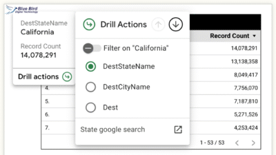
3. Drill-Down Actions
-
Clicking a summary widget opens a detailed analytics view.
-
Makes data exploration seamless and intuitive.
Role-Based Access and Permissions
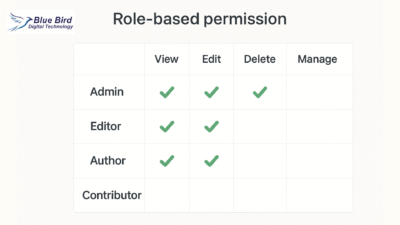
Role-Based Permission
Security and data privacy are vital for any no-code platform. Every user should only see the information relevant to their role.
1. Role-Based Views
- Admin: Access to all modules
- Manager: Access to reports and analytics
- User: Limited to personal data
2. Data-Level Permissions
Hide or mask sensitive information (e.g., customer phone numbers or emails) for specific roles.
3. Audit Trails
Track who made changes and when—essential for accountability.
Custom Widgets and Modular Design
One of the biggest advantages of no-code platforms is flexibility. Users should be able to add, remove, or rearrange widgets.
Examples of Custom Widgets:
-
KPI cards
-
To-do or task panels
-
Activity timelines
-
Map visualizations
-
Custom HTML embeds
A modular dashboard lets each user tailor the layout to their workflow, improving personalization and engagement.
Tip: Allow “drag-and-drop” widget rearranging for better user experience.
Performance Optimization
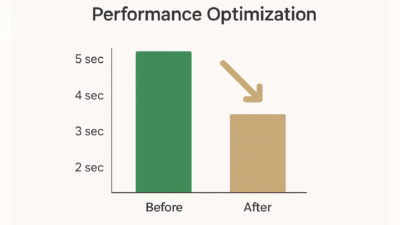
Before-and-after chart showing speed improvement
Dashboards packed with visual data can become heavy, which impacts speed. Performance optimization keeps the interface fast and smooth. Implement lazy loading so widgets load only when visible, and use data caching to store frequent API results locally.
Pagination or virtual scrolling prevents browsers from loading thousands of records at once, and compressing images or minifying code ensures lighter page loads. Optimized dashboards improve both user experience and SEO, keeping bounce rates low.
1. Lazy Loading
Load widgets only when they appear on screen.
2. Data Caching
Store frequent API results locally for faster reloads.
3. Pagination & Query Limits
Avoid rendering thousands of rows at once.
4. Lightweight Assets
Compress images, minify scripts, and optimize fonts.
Security and Data Protection
Data security is non-negotiable in any no-code environment. Every no-code app builder dashboard should be shielded by SSL encryption to protect data in transit. Authentication methods like JWT or OAuth ensure safe API access, while input validation prevents SQL injection or cross-site scripting attacks.
Regular backups and recovery systems safeguard against data loss, ensuring that even in the event of failure, no critical information is lost.
Testing and Continuous Feedback
No dashboard is perfect on launch day. Regular testing and iteration are essential for long-term success. Usability testing identifies areas where users struggle. A/B testing compares different versions of layouts or colors to find what works best. Performance testing simulates heavy loads to ensure stability under stress.
Finally, integrating a feedback button directly within the dashboard invites users to share insights or feature requests. This continuous feedback loop ensures your no-code dashboard evolves alongside user needs.
Launch and Continuous Improvement
Once your dashboard is live, monitor how users interact with it. Use analytics tools to measure performance metrics like:
-
Average session duration
-
Widget usage rate
-
Most-clicked features
Based on the data, regularly:
-
Update visuals
-
Add new widgets
-
Optimize load times
-
Improve UX elements
Continuous improvement ensures your dashboard stays relevant and user-friendly.
Best Practices for a Successful No-Code Dashboard
To summarize, here are the best practices to always follow:
-
Focus on clarity over complexity
-
Keep navigation intuitive and consistent
-
Highlight key metrics first
-
Ensure mobile responsiveness
-
Use minimal yet meaningful colors
-
Protect user data at every level
-
Collect and act on user feedback
-
Update and maintain regularly
The Bottom Line of No-Code App Builder Dashboard
A well-designed no-code app builder dashboard bridges the gap between technology and usability. It empowers users to take control, analyze performance, and make data-driven decisions—without ever touching a line of code.
By combining intuitive UX design, powerful data visualization, modular structure, and strong security, you can build a dashboard that not only looks stunning but also delivers measurable value.
Whether you’re creating for startups, enterprises, or personal projects, remember: a great dashboard doesn’t just show data—it tells a story.
it’s intresting blog
thanks leo
Awesome article! The way you explained the essential features of no-code app builder dashboards is really clear and insightful. I love how you emphasized the importance of user-friendly design and how to implement it effectively. I’m definitely going to explore some of the tools you mentioned!
thank you
Great read! The guide makes it so much easier to understand the key components of building no-code app dashboards. I especially liked the section on best practices—it’s exactly the kind of info that helps avoid common mistakes. Looking forward to using these tips in my own projects!
thank you so much